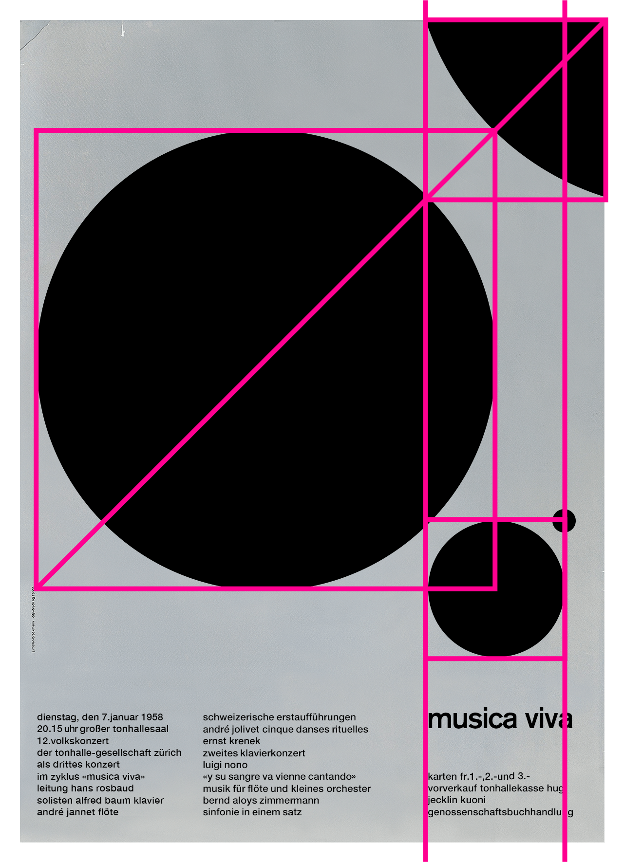
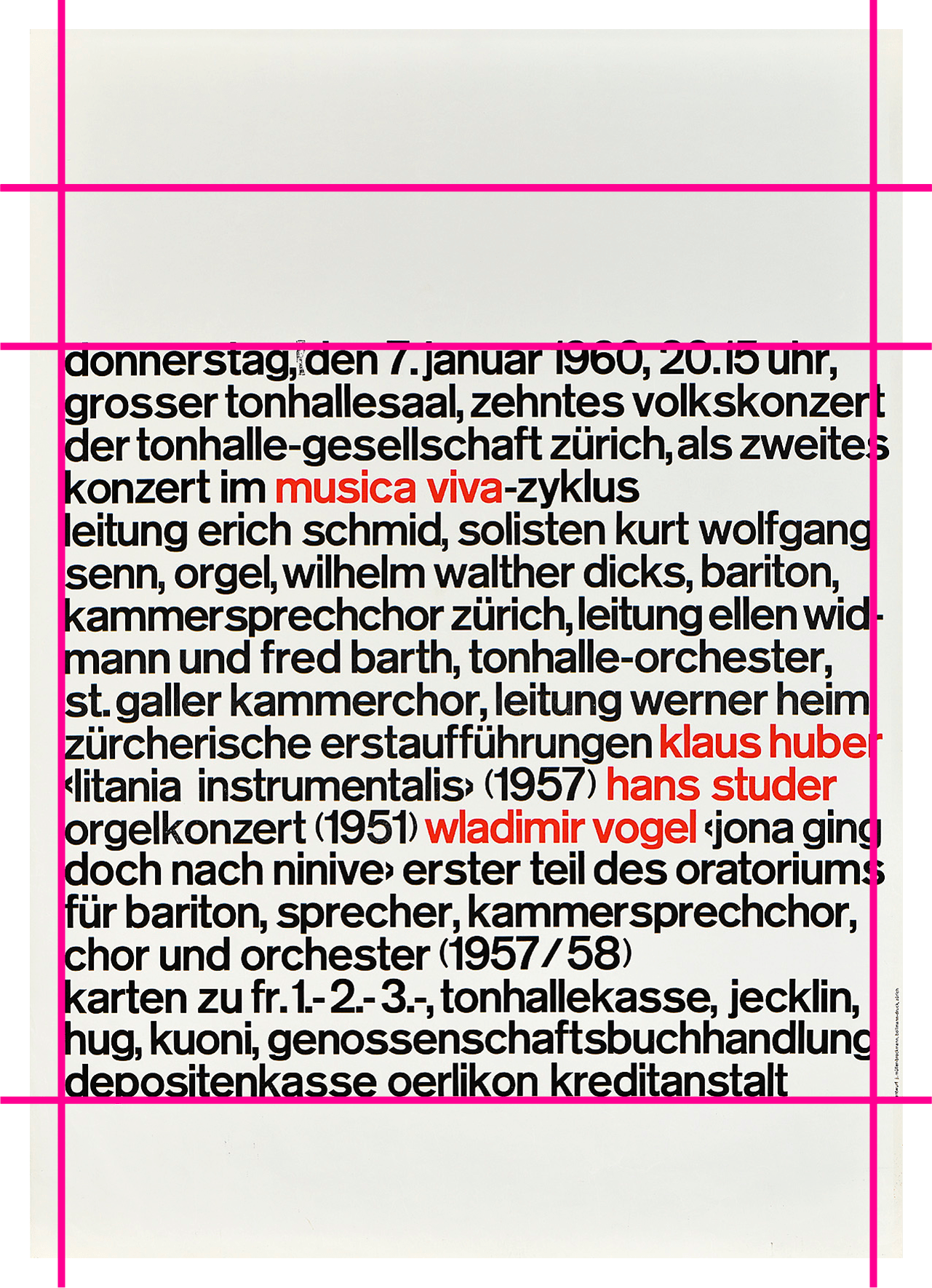
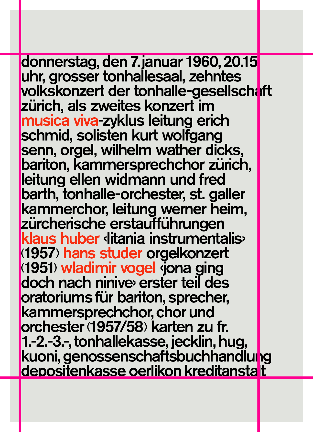
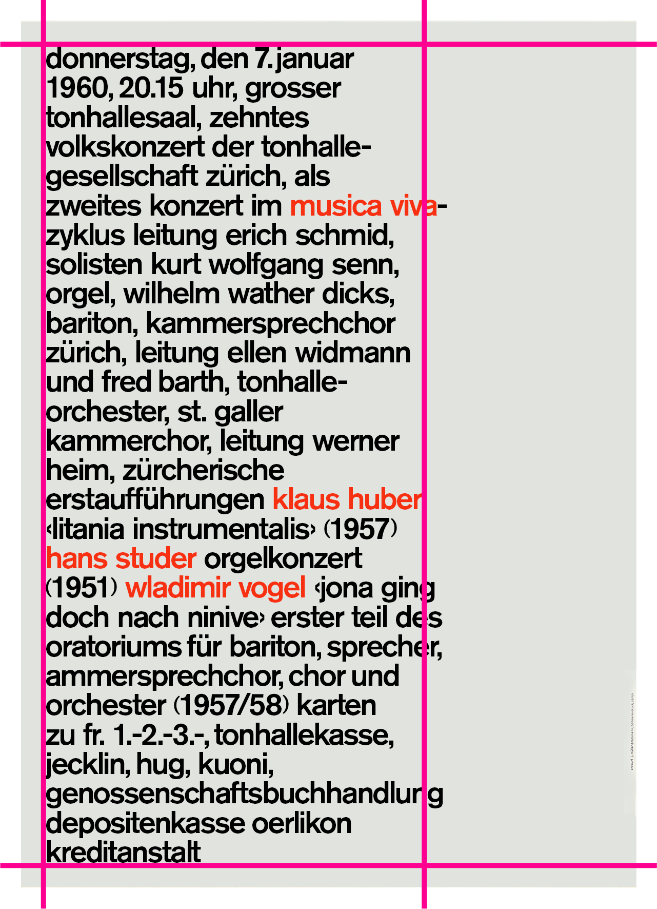
The Swiss Grid was an exhibition at Poster House in New York City that launched February 26, 2020. Ten days after opening, the museum shut down due to Covid-19. With input from designers and educators, Poster House transitioned the exhibition into a remote learning tool that provides historical and pedagogical context for some of the technical teachings of design.

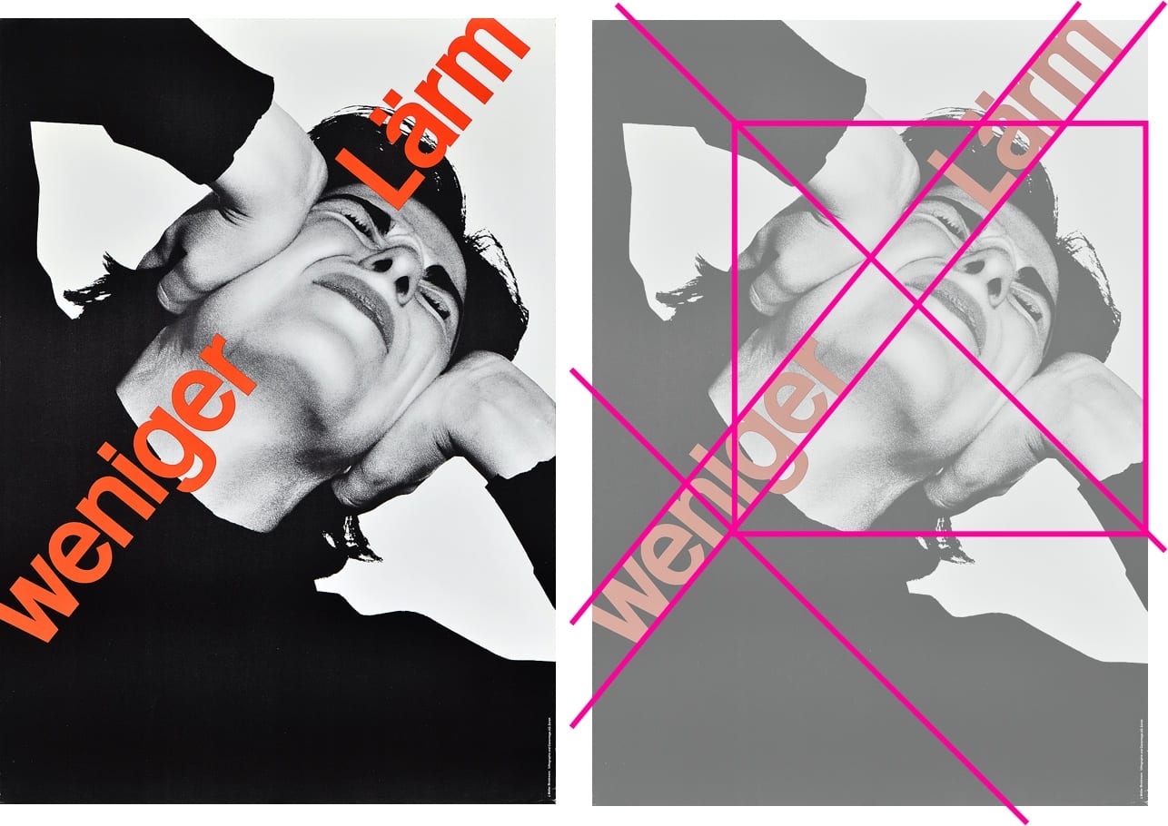
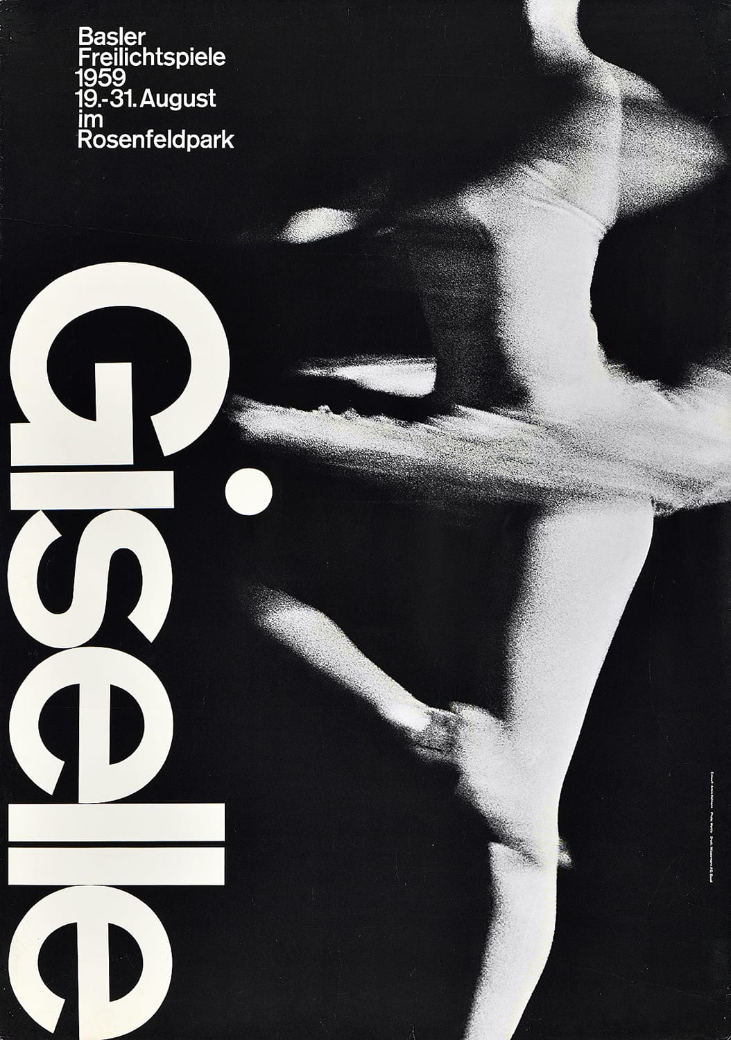
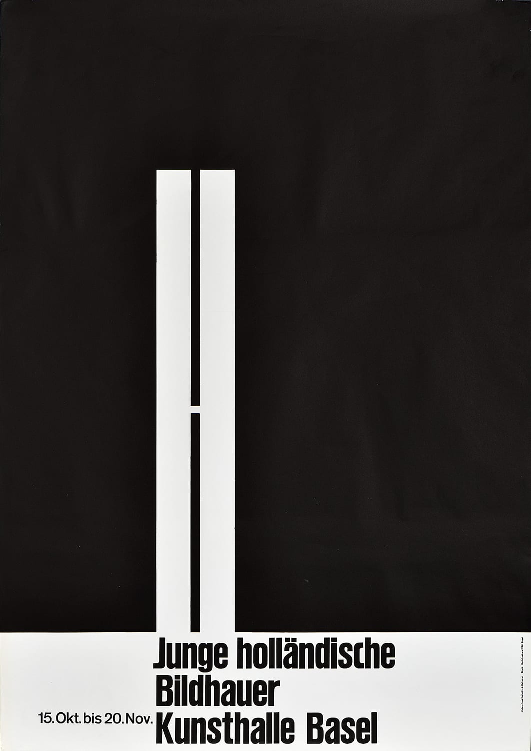
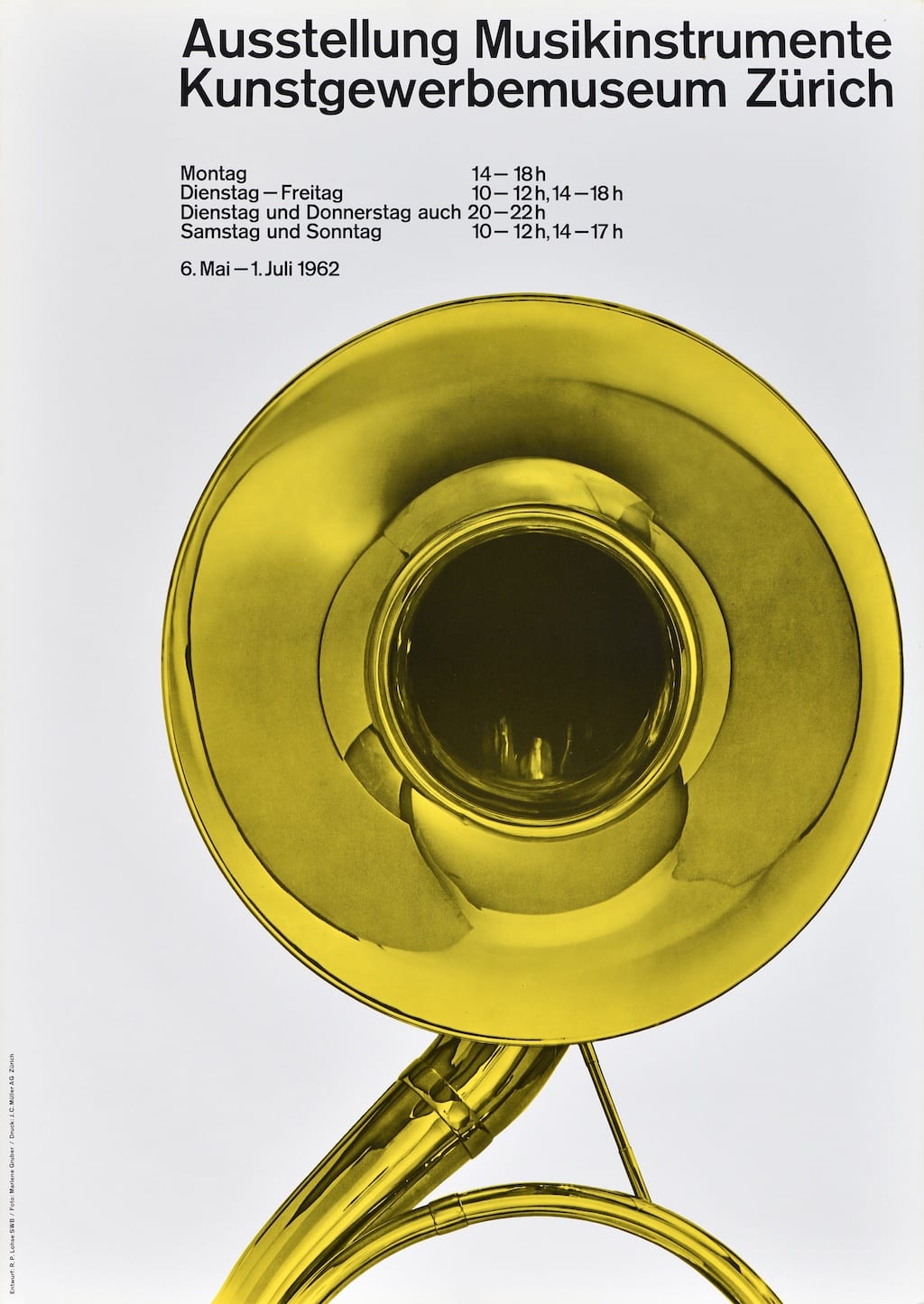
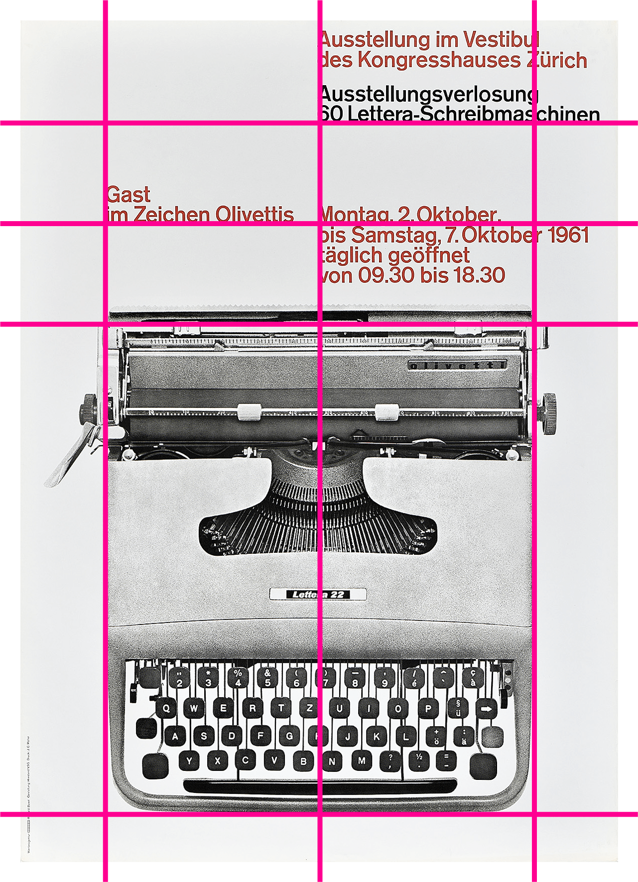
Using the core material from the original exhibition, this site considers how a particular aesthetic—referred to throughout as “The Swiss Grid”—developed out of post-WWII Switzerland and spread around the world through generations of practitioners, and how the grid was used to create incredible posters for the cultural sector. This microsite interweaves contemporary attitudes towards teaching mid-century Modernism and the desire to both break free of and find new use for grid systems in contemporary design.

The

Grid

System

The Swiss Grid


Since its emergence in the 1950s, no other graphic design legacy has had a greater impact than the Swiss grid. Whether adhering to it, playing with it, or decrying it, it is the staple of mid-century Modernism whose influence has never waned.

The 1950s was by no means the first time grid structures appeared in design, but it marked the birth of a particular set of rules put in place by its practitioners, and the era remains a cultural touch point across the world. The Swiss grid avoided referencing historic stylistic trends traditionally associated with any single country, thus appearing universal, anonymous, and modern. As such, it spread to all aspects of visual messaging, from book layouts to subway signs, posters to instruction manuals. Additionally, in a fractured postwar era, the trilingual publications produced in Switzerland spread around the world, coming to define Modern design and reinforcing grid-based layouts.

Key designers published their own textbooks and took up teaching positions in Europe, the United States, India, Latin America, Japan, and beyond, ensuring that the next generation of graphic designers was familiar with the flexible grid.

Multinational corporations also saw grid-based design as an efficient problem-solving device for the new global market, and it was quickly accepted as a “neutral,” universally appealing aesthetic that was ideal for conveying information clearly.

The posters at the heart of this exhibition show how the grid was adapted with precision and whimsy for many cultural clients, and how it was applied in surprising ways to create balanced and detailed compositions with minimal motifs, many of which remain icons of the era.

Black and white headshot of a woman wearing glasses and a buttoned shirt.

Audrey Bennett

MDes Program Director and Professor, Stamps School of Art & Design

Commentary

While white Western practitioners are most often credited with the development of the grid structure, Bennett traces its origin to ancient African architecture and repositions African design as the source of this universally appealing aesthetic.

Read Bennett's Full Essay, “Follow the Golden Ratio from Africa to the
Bauhaus for a Cross-Cultural Aesthetic for Images”

Before The Grid

Most posters would also have to be redesigned in one or more of the country’s four languages (German, French, Italian, and Romansh) to meet governmental rules on advertising—an artistic challenge as many translated words or phrases took up different quantities of space on a page. By the late 1950s, however, this illustrational style had run its course. Idyllic imagery seemed dishonest in the postwar years, and companies within a newly unified Europe sought to access a growing international market as efficiently and cohesively as possible.

PKZ, 1924, A. Ernst Kretschmann (1897–1941), Poster House Permanent Collection

Primarily a military painter, this is Kretschmann’s only known poster.

Founded in 1881, PKZ was Switzerland’s first men’s department store and produced some of the best posters within the country. This design is no exception, combining a touch of Art Deco with classic illustrational techniques.

Text was typically expressive and artistically integrated into the compositions.

PKZ, 1923, Otto Baumberger (1889–1961), Poster House Permanent Collection

Baumberger is one of Switzerland’s most important and prolific graphic designers, creating over 200 posters during his career.

This poster is a marvelous example of the Sachplakat (Object Poster) style in which a product is presented in a simple close-up with little additional visual material. The assumption is that the product can sell itself.

Baumberger ingeniously uses the tag on the coat to indicate the brand, leaving no need for additional promotional text.

Before the development of the grid, Switzerland had already embraced a cohesive aesthetic that set it apart from the rest of Europe. Around 1914, poster sizes within the country were standardized (known as the Weltformat or World Format poster) and rules were introduced establishing where posters could be officially displayed in public. Designers excelled at the classic illustrational poster, promoting tourism through sun-dappled landscapes and products through handsome renderings of goods.

Turnfest in Basel, 1912, Eduard Renggli (1863–1921), Poster House Permanent Collection

First held in 1832, the Federal Turnfest in Switzerland is the country’s largest sporting event, focusing primarily on gymnastics and other athletic feats.

Renggli’s poster shows the wispy, atmospheric treatment of line that dominated Swiss design in the 1910s.

Turnfest in Basel, 1912
Eduard Renggli (1863–1921)

PKZ, 1923
Otto Baumberger (1889–1961)

PKZ, 1924
A. Ernst Kretschmann (1897–1941)

Swiss
Style

What is Swiss Style?

Swiss Style is known by many different names, often used interchangeably. Some other terms you may see which refer to the same style are:

International Typographic Style

Anonymous Style

Swiss International Style

Why Switzerland?

1939

As a neutral territory, Switzerland was one of the few European countries to emerge relatively unscathed from World War II. Unlike its neighboring countries, its infrastructure had not been destroyed, its citizens had not been witness to mass bloodshed, and its economy had been steadily recovering since the crash in 1929.

Foreign artists and innovators saw the country as a haven, taking up teaching positions in Zürich and Basel where their forward-thinking ideas were nurtured. While the rest of the world recovered, Switzerland had the luxury of focusing on cultural growth.

1941

The government and professional organizations started sponsoring design competitions like The Best Swiss Poster, touring the winning designs both at home and abroad. Museums hosted exhibitions about new Swiss design, inviting the artists to lecture and create catalogs and posters for the shows.

1944

Design publications like Graphis (1944) also flourished, introducing Swiss graphics to the world through trilingual volumes in English, German, and French.

Most of the winners of these competitions, as well as the people creating the exhibition posters and new publications, were professors at the two biggest design schools in Switzerland—the Allgemeine Gewerbeschule (later the Schule für Gestaltung) in Basel and the Kunstgewerbeschule in Zürich—where grid-based design was being developed and taught. These numerous outlets allowed this particularly Swiss style to spread and saturate the international design community with unprecedented speed.

1948

By the late 1940s, homegrown companies around the world with an eye for the increasingly international market wanted recognizable brand identities that set them apart from the competition. This crisp, easy-to-understand means of communication was at once particularly “Swiss” and adaptable to any country. And so these brands turned to the professors in Zürich and Basel to define a new advertising age.

Map of the Allied Powers and the Axis Powers with neutral Switzerland, with different territories colored in green, red, purple, or white.

Map of the Allied Powers and the Axis Powers with neutral Switzerland.

Fiera Svizzera Basilea, 1941, Peter Birkhauser (1911–76), winner of The Swiss Poster Award.

A magazine cover of various large letters set on a page in red, green, and white on a black background.

Graphis, Issue No. 99

An assortment of logos from different time periods by companies Pepsi, American Airlines, IBM, and Volkswagen.

Companies rebranded, trading in complex logos for crisp forms and cleaner typography as initiated by “Swiss” design.

Typography

You will notice that three major font families are used in Swiss posters from this time. Each has its own unique history.

| Akzidenz Grotesk Bold

| Univers 65 Bold

| Helvetica Bold

Developed as Royal Grotesk c. 1890 by Ferdinand Theinhardt, the Berthold type foundry in Berlin would rename it Akzidenz Grotesk when it purchased Theinhardt’s foundry from the Mommen brothers in 1908. This would become the preferred font of the Zürich School. It is also referred to as Accidenz-Grotesque or, after it had been introduced in the United States and Great Britain in the 1960s, as Standard, and would include slight variations depending on which point size was used. A “grotesk” refers to any sans-serif typeface of the 19th century and beyond, while “akzidenz” translates loosely to “everyday jobbing” (as opposed to book printing).

This specimen is typeset in Akzidenz-Grotesk Pro, a digital, OpenType version released by Berthold Types in 2007.

Developed in France by former Zürich design student Adrian Frutiger, this typeface would be released by the Deberny & Peignot foundry in 1957. It was specifically designed for photocomposition (where letterforms on glass are projected at any desired size onto film to be printed via offset lithography) and metal type. It was the preferred font family of Emil Ruder and his followers, considered by many designers to be more elegant and less rigid than pre-existing grotesks. It was also offered in a more consistently designed and visually harmonious family of weights and widths than either Helvetica or Akzidenz Grotesk. Univers has the added benefit of being one of the few sans-serif typefaces legible enough to be used for book publication.

This digital version of Univers was released by Linotype in 1997.

Originally known as Neue Haas Grotesk, this typeface was developed by Max Miedinger and Eduard Hoffmann of the Haas Typefoundry in Munchenstein, Switzerland in 1957. It was renamed Helvetica (meaning “the Swiss one”) a few years later by D. Stempel, the German foundry who had part interest in Haas and also owned German Linotype. The renaming of the font by Stempel and its adaptation to the linotype machine enabled the widespread European popularity of Helvetica. Based on Akzidenz Grotesk, it gave stronger consideration to machine typesetting and had an overall goal of being visually neutral. Helvetica would eventually become the main export of the Swiss Style, redefining corporate and governmental communication around the world. You will notice, however, that no posters in this show feature Helvetica.

This is Helvetica Now® Text Bold, a redrawn version of Helvetica released by Monotype in 2019.

Designers

Many of the influential Swiss designers
can be divided into two basic schools—
Basel and Zürich.

The Zürich and Basel camps of Swiss design can both be traced back to a single man: Ernst Keller. Teaching at the Kunstgewerbeschule from 1918–56, he is often referred to as the Father of Swiss Style, having directly trained most of the key players who would go on to define this movement. While he did not explicitly promote the use of a grid system, his teaching methods put communication first, focusing on typography over illustration.

At the same time, postwar Zürich was a hotbed of artistic activity: Bauhaus students like Max Bill promoted Concrete art that, like De Stijl and Constructivism, emphasized abstract geometry, while Jan Tschichold’s highly praised 1928 publication The New Typography glorified asymmetry and photomontage in graphic communication. These landmark influences put some of Keller’s students in the perfect position to develop a specific design tool that stressed clarity and communication over all else: the flexible grid.

Basel

Basel

  • Looser adherence to the grid
  • High contrast photography
  • Artistically placed lettering
  • Experimentation with Univers

Basel

Emil Ruder

Emil Ruder (1914–70)

Ruder studied design at the Kunstgewerbeschule Zürich, and was heavily influenced by the Bauhaus masters. In 1942, he became the first of the new generation of design professors to teach at the Allgemeine Gewerbeschule Basel.

Ruder emphasized clarity through typography and was considered to be the most important mind in the field after Jan Tschichold.

By the late 1940s, he had formed a strong relationship with fellow professor Armin Hofmann, collaborating with him on many posters that would become icons of the Swiss movement.

In 1967, Ruder wrote the trilingual Typographie, a basic manual on type design that became one of the most popular and influential books on Swiss Style. It is still used today.

Hermann Eidenbenz

Hermann Eidenbenz (1902–93)

Eidenbenz studied and worked with Ernst Keller in Zürich before teaching at the Kunstgewerbe in Magdeburg alongside Julius Klinger. In 1932, he opened a design studio in Basel, becoming one of the first figures in the field to describe himself as a “graphic designer.” He would also teach at the Allgemeine Gewerbeschule from 1940–43.

He started to explicitly use grid systems in his work as early as 1947.

Armin Hofmann

Armin Hofmann (1920–2020)

One of the most prolific and prominent teachers of the Swiss Style, Hofmann began his career in Zürich before taking a position in 1947 at the Allgemeine Gewerbeschule Basel where he taught alongside Emil Ruder and further developed his design philosophy.

He traveled extensively outside of Switzerland, taking up teaching positions in Philadelphia, New Haven, and Ahmedabad, India. An overwhelming number of his students would go on to become leaders in the design field.

His aesthetic emphasized harmony among point, line, and plane in two-dimensional compositions, highlighting contrast and tension between forms. While he used flexible grid systems to create his posters, he did not rigidly adhere to them.

Karl Gerstner

Karl Gerstner (1930–2017)

Trained as a typographer, Gerstner studied under Emil Ruder in Basel. He opened his own studio in 1949, and in 1963 would become one of the three founders of GGK, one of the most important advertising agencies in Switzerland.

His writings on typography and flexible gridsystems (which he called “programmes”) would push and define the style more than those of any other designer. His grid systems are highly complex and innovative.

He believed in the notion of “integral typography,” in which the message and the form of the type are codependent, operating as one unit in order to be properly understood.

Fridolin Müller

Fridolin Müller (1926–2006)

Müller trained at the Allgemeine Gewerbeschule in Basel under Armin Hofmann and Emil Ruder from 1945–1950. He briefly replaced Karl Gerstner as lead designer for the international pharmaceutical company Geigy before moving to Zürich to open his own studio.

In 1965, he taught at the National Design Institute in Ahmedabad, India. He would go on to teach at the Philadelphia College of Art (now The University of the Arts).

Robert Büchler

Robert Büchler (1914–2005)

Büchler studied at the Allgemeine Gewerbeschule Basel before becoming a typography professor there. Obsessed with type, he was on the cutting edge of advances in the field, introducing phototypesetting to the curriculum that allowed for greater manipulation of letterforms.

Ruth Pfalzberger

Ruth Pfalzberger (b. 1949)

Pfalzberger studied under Armin Hofmann at the Allgemeine Gewerbeschule Basel before opening her own design studio. She produced work with Karl Domenic Geissbühler, a student of Keller’s and one of the most important contemporary Swiss posterists, for many years.

She was the in-house designer for the Department of Chemistry at the University of Basel.

Markus Kutter

Markus Kutter (1925–2005)

After studying in Basel, Kutter joined the international chemical company Geigy in 1953, where he helped shape the now-legendary information department that spread Swiss Style around the world.

In 1959, he co-founded GGK along with Karl Gerstner and Paul Gredinger.

Zürich

Zürich

  • Strict adherence to the grid
  • Less photography
  • More reliance on prominent text
  • Preference for Akzidenz-Grotesk

Zürich

Josef Müller-Brockmann

Josef Müller-Brockmann (1914–96)

Perhaps the figure with the most recognizable name from this period, Müller-Brockmann studied, worked, and eventually taught in Zürich where he set the standard for how the world viewed grid systems associated with Swiss Style.

He brought the mathematical principles of the Concrete art movement into all his design work which is especially evident in his use of flexible grids. Because he saw grid systems as an extension of Concrete geometry, he denied claims that he invented the design grid.

After he moved into a shared studio with the photographer Ernst A. Heiniger in 1954, Müller-Brockmann began adding photography into his posters. He stopped this practice in the early 1960s in an effort to rid his designs of all subjectivity.

Along with Richard Paul Lohse, Carlo Vivarelli, and Hans Neuburg, he founded Neue Grafik, a Zürich-based publication that only lasted from 1958–1965, but which shaped the international conversation about contemporary design.

Paul Rand believed so strongly in Müller-Brockmann’s work that he appointed him the European design consultant for IBM in 1966.

Richard Paul Lohse

Richard Paul Lohse (1902–88)

After working under Ernst Keller at the Kunstgewerbeschule in Zürich, Lohse joined the advertising agency of Max Dalang, where he worked alongside Hans Neuburg. In 1937, he became one of the cofounders of Allianz, the Association of Modern Swiss Artists, and in 1954 he took a leadership position at the Swiss Werkbund (the organization responsible for the many “Good Design” exhibitions that traveled throughout Switzerland and abroad).

As early as 1953, Lohse began incorporating grid systems into his work, making him one of its earliest practitioners and pioneers.

Along with Müller-Brockmann, Neuburg, and Vivarelli, he co-founded the landmark design publication Neue Grafik, which promoted the design vision of the Zürich camp.

Ernst Hiestand

Ernst Hiestand (b. 1935)

Trained at Zürich’s Kunstgewerbeschule, Hiestand would return to become the Head of the Visual Communications Department. From 1960–1981, he operated a private firm with Ursula Hiestand. In 1972, they redesigned the Swiss bank notes as well as the wayfinding signage for the city of Zürich’s transit department that is still used today.

Hans Neuburg

Hans Neuburg (1904–83)

Neuburg studied under Orell Füssli before opening his own design studio in Zürich. A prolific writer on the topic of graphic design, he would go on to co-found the journal Neue Grafik as well as publish numerous important design books.

Carlo Vivarelli

Carlo Vivarelli (1919–86)

Vivarelli studied under Keller at the Kunstgewerbeschule Zürich before moving to Paris to apprentice under the legendary Art Deco poster designer Paul Colin. Upon returning to Switzerland, he served as a commercial designer for companies like Electrolux, Roche, and Philips.

He also co-founded Neue Grafik with other members of the Zürich school.

Nelly Rudin

Nelly Rudin (1928–2013)

After studying in Basel, Rudin created design for the chemical company Geigy before moving to Zürich to work for Ernst Heiniger and Josef Müller-Brockmann. At a time when only ten women were part of the Verband Schwizerischer Grafiker (the professional organization for Swiss designers), Rudin found notable success in the field, opening her own firm in 1958.

Gottfried Honegger

Gottfried Honegger (1917–2016)

Honegger both studied and taught at the Kunstgewerbeschule Zürich before opening a design studio with his wife, the illustrator Warja Lavater. Between 1955–1958, he was the Art Director at the chemical company Geigy—a brand that shaped the conversation about the corporate use of modern design.

Aldo Calabresi

Aldo Calabresi (1930–2004)

A student of Keller’s, Calabresi studied typography at the Kunstgewerbeschule Zürich before moving to Italy to take up a position at Studio Boggeri, the leading modernist design studio in Italy since its founding in 1933.

While he worked for many iconic brands over the years, he is best known for creating the latest corporate identity for Alfa Romeo.

Rosmarie Tissi

Rosmarie Tissi (b. 1937)

Tissi started her education in Zürich before apprenticing under Siegfried Odermatt, with whom she would eventually set up a design studio. She would ultimately push the boundaries of modernist Swiss design, breaking the grid in her later work as she became influenced by the experiments of Wolfgang Weingart and others.

Commentary

Ramon Tejada plays a classic game of Kill Your Idols. Growing up with the canon of Swiss design, he tells the story of how he learned to use grids to showcase personality and culture as opposed to acting as rigid monoliths, and highlights diverse uses of grid design from around the world.

Black and white headshot of a man wearing a coat and a plaid scarf.

Ramon Tejada

Assistant Professor,
Rhode Island School of Design

Read Full Transcript

1/48

Posters Exhibited in
The Swiss Grid

Click on a poster to view details

Auch Du Bist Liberal, 1959
Karl Gerstner (1930–2017)

This election poster stating “you, too, are liberal,” plays on the 1914 British enlistment poster featuring Lord Kitchener, a pose made iconic by James Montgomery Flagg’s “I Want You” design in 1917.

The out-of-focus image allows the viewer to imagine a person of any gender in the role, while the use of “du” (a familiar form of “you” reserved primarily for family members) adds an extra element of intimacy to the composition.

Stadt Theater Basel, 1964
Armin Hofmann (1920–2020)

Hofmann produced numerous posters throughout the 1950s and ‘60s for the Basel City Theater.

The rectangular box at the lower left is demarcated so that a weekly schedule of events can be placed inside it. This allows the poster to remain in use for an entire year, avoiding the cost of designing and printing a new image every few weeks.

Weniger Lärm, 1960
Josef Müller-Brockmann (1914–96)

Paid for by the Swiss Committee for Noise Abatement, this photo-offset poster was hung in groupings throughout Zürich, encouraging citizens to be aware of the unpleasantness of noise pollution.

Between 1947 and 1952, the number of cars doubled in Switzerland, leading to numerous PSAs related to safety and general social courtesy. By the late ‘50s, aviation and construction noises had also become a major nuisance for city dwellers.

In this design, the grid has been shifted to 50 degrees, providing a visual tension that not only echoes, but also enhances the message of the poster.

London Telephone, 1957
Josef Müller-Brockmann (1914–96)

Printed via photo-offset lithography in three different languages, this poster promotes the London Telephone company as the quickest and cheapest method of communication around the world.

Some speculate that actual telegram type was enlarged and printed alongside the photo of the telephone operator.

Citroën, 1958
Karl Gerstner (1930–2017)
Markus Kutter (1925–2005)

One of many works Gerstner and Kutter would create for the Citroën automotive company, this poster announces an exhibition and competition in which a car is first prize.

Printed via photo-offset lithography, the red text appears in three different sizes, creating a visual force comparable to the weight of the head-on automobile that grounds the composition.

Gerstner was especially fond of running certain elements off the page to create impact. Here, the tail of the “1” bleeds to the edge of the paper, while the car is sliced so that its edge runs along the same grid as the body of the number.

Perhaps inspired by the writings of Max Bill, none of the proper nouns in this poster are capitalized.

Olivetti, 1961
Ernst Hiestand (b. 1935)

Two versions of this poster exist: This one, announcing that 60 Olivetti typewriters will be given away as raffle prizes at an exhibition in Zürich, and a more common version that just promotes the brand itself.

Rather than display the typewriter from the side, Hiestand chose to present it from above, creating a flat plane that emphasizes the geometric layout of the page.

Fun Fact: The Lettera 22 typewriter was designed by Marcello Nizzoli, the artist who created the Art Deco Campari poster in our timeline upstairs!

Musica Viva, 1958
Josef Müller-Brockmann (1914–96)

Presented in the order in which they were made, these three letterpress posters are part of a series Müller-Brockmann designed for the Zürich Tonhalle. Seen together, they demonstrate the flexibility of the grid system, from a combination of three columns and precisely-measured geometric images to a monolithic block of solid text, to two separate columns of differing weights.

Staying true to a flexible grid system, the circles in the first poster are all mathematically related.

Musica Viva, 1960
Josef Müller-Brockmann (1914–96)

The latter two posters (printed two months apart) highlight the title of the series along with the most important performers, emphasizing them through the use of red rather than the music they would be playing. By not using capital letters, the spaces between lines of text and the letterforms themselves (leading and kerning) are more comfortably condensed, creating a weightier block of information. This is underscored by the parentheses which are in a slightly smaller point size than the rest of the text. Most printers would not have had enough wood or plastic type in a single size of Akzidenz Grotesk to create such a word-heavy poster.

Do you notice a mistake in the printing of the middle poster? In the first line of text, a spacing element in the letterpress process has been accidentally inked, leading to some transfer. This imperfection speaks to the manual nature of this printing process.

Musica Viva, 1960
Josef Müller-Brockmann (1914–96)

Müller-Brockmann’s evolution in style expressed through these three posters was inspired by Vivarelli, who insisted that even geometrical forms could be too subjective and that the information alone could become the image if presented harmoniously.

Berlin, 1963
Emil Ruder (1914–70)

This poster promotes an exhibition about Berlin, “the largest city in Germany.”

It is a two-sheet, letterpress design with a combination of hand-cut lettering (Berlin), plastic type (the subheading), and metal type (the text at the lower left). The skinny, hyper-extended letterforms in the upper register combined with remarkably tight kerning give the poster a dynamism and sense of energy impossible to impart through metal type alone.

Die Zeitung, 1958
Emil Ruder (1914–70)

This poster promotes an exhibition of newspaper history at the Gewerbemuseum in Basel.

Due to the close relationship between museums and schools in Switzerland, this poster would have been executed by Ruder’s students as part of an in-class exercise, with each student working on a single element. As the school only had smaller printing presses, the poster is made up of two sheets of paper.

The giant “z” and the halftone image of the boy are hand-cut into linoleum, while the lower text is a combination of plastic (“die Zeitung”) and metal type. The entire piece is printed via letterpress in one lockup.

Winterhilfe, 1969
Ruth Pfalzberger (b. 1949)

This trilingual, photomontage design set in Univers announces an annual winter charity appeal. Founded in 1936, its aim is to help the poor get through the country’s harsh winters.

In photomontage compositions like this, the images were cut out and set on stark white backgrounds prior to printing to make them stand out.

Industrieware von Wilhelm Wagenfeld, 1960
Fridolin Müller (1926–2006)

This photolithographic poster advertises an exhibition of the work of Wilhelm Wagenfeld, an industrial designer from the Bauhaus school known for his sleek, pared-down home goods.

The mathematical breakdown of the stove pot also serves to reveal part of the complex underlying grid structure behind the poster.

Typographie, 1960
Robert Büchler (1914–2005)

This poster advertises an exhibition of 50 years of handset typography at the Gewerbemuseum in Basel. Emil Ruder based his design for the exhibition catalog on this image.

The visual rhythm of this composition is derived from Büchler’s separation of the upper- and lowercase vowels from the consonants, creating groupings that ultimately lead to the letter “t” for typography—the title of the show.

Set in Akzidenz Grotesk, this poster was printed through linoleum linocut for the main body and metal type for the smaller text at the bottom.

Sammlung Richard Doetschbenziger, 1957
Emil Ruder (1914–70)

Using the simplified outline of an open book as a framing device, this poster advertises an exhibition of East Asian books and miniatures from the collection of Richard Doetschbenzinger, held one year before his death.

This two-sheet letterpress design was printed through a combination of hand-cut linoleum (the outline of the book and larger text) and metal type (smaller text on the right).

Schützenfest, 1963
Fridolin Müller (1926–2006)

Held approximately every five years, a Schützenfest is a target-shooting festival in which thousands of young men compete to be the best marksman. As all men in Switzerland must serve in the military, this is considered a national tradition dating back to the Middle Ages.

Müller’s stark composition uses an enlarged black circle to represent both the barrel of a gun and a target—a perfect example of minimal means with maximum expression.

The poster’s simple, direct design meant it could be easily translated into the other main languages of Switzerland without needing to alter the composition.

Medea, 1972
Josef Müller-Brockmann (1914–96)

This photo-offset poster combines printed Akzidenz Grotesk type in the upper registers with a giant hand-cut “m” dominating the lower half of the page.

Müller-Brockmann created dozens of posters for the Zürich Opera House, almost all of which are a simple but effective combination of text and color with no pictorial image. Here, he focuses on a giant lowercase “m” to advertise a production of Medea.

Giselle, 1959
Armin Hofmann (1920–2020)

One of Hofmann’s most iconic designs, this poster promotes an outdoor performance of the ballet Giselle.

This is one of the many instances in which Hofmann breaks from a gridded structure in favor of design sensibility. While the majority of the text mathematically relates to the placement of other elements within the poster, the dot on top of the “i” in the title extends beyond the ascension of the letterforms. It also is round (dots and periods in most sans-serif typefaces at this time are square), cheekily nodding to where the dancer’s knee would be and cleverly tying the title to the image.

The title has most likely been printed from enlarged metal type that has been tightly spaced.

Hofmann also allows the serif on the number “1” to hang off the grid line so that the body of each number aligns with the letters below, thus creating a more satisfying visual rhythm.

Printed via photo-offset, the white of this poster is the actual paper. It provides a stark contrast to the gentle halftones of the nearly-abstracted photograph that elegantly suggests movement rather than the presence of a human figure.

Junge Holländische Bildhauer, 1960
Armin Hofmann (1920–2020)

This letterpress poster advertises an exhibition of Dutch sculptors at the Kunsthalle Basel.

Slight irregularities in the giant “h” indicate that it was hand-cut in linoleum, while the lower text is most likely Haettenschweiler Schmalfette wood type (designed by Walter Haettenschweiler, a student of Ernst Keller, in 1954).

Ausstellung Musikinstrumente, 1962
Richard Paul Lohse (1902–88)

This poster promoting an exhibition of musical instruments is one of the few designs that breaks from the classic black-white-red color combination that dominates this show.

The position of the tuba aggressively facing the viewer flattens the instrument and emphasizes its geometric structure.

Note how Lohse has aligned the hours of the exhibition so that the right side of the numbers are locked to the grid, rather than the more typical left side.

What If We Altered The Grid?

Grid A
Original
Grid B
Grid C
Grid A
Original
Grid B
Grid C
Grid A
Original
Grid B
Grid C
Grid A
Original
Grid B
Grid C
Grid A
Original
Grid B
Grid C

Explore Posters

>

Black and white headshot of a woman with short hair wearing hoop earrings and a collared shirt.

Kelly Walters

Assistant Professor,
Communication Design,
Parsons School of Design

Commentary

What happens when you apply the grid to different source material? Kelly Walters works with her students to bring cultural references into the classroom in order to represent the emerging field more accurately and find new ways to challenge and manipulate the grid.

Read Walters' Full Essay

>

Black and white headshot in profile of woman with her long hair in a bun and wearing a collared shirt.

Shani Sandy

Design Executive, IBM

Commentary

Shani Sandy has been working to expand the pipeline of BIPOC designers, partially through the creation of a timeline of pioneers and forebears in the field during the height of modern graphic design and the Bauhaus.

See Shani's Message

Student Assignments

The Swiss Grid was originally exhibited at Poster House from February 27, 2020–February 14, 2021.

About this site

The Swiss Grid microsite is an experiment in adapting a museum exhibition for the virtual realm. While available to all audiences, the site was developed with the transition to remote learning in mind. It was an opportunity to engage with educators and designers about current conversations in the classroom, and to include more voices on the original exhibition content.

Exhibition Curation by

Angelina Lippert

Contributions by

Audrey Bennett
Ramon Tejada
Kelly Walters
Shani Sandy
Curry Hackett

#PHSwissGrid

Website by

KUDOS Design Collaboratory

The collection of posters comes to Poster House through a generous loan from Tom Strong.

Special Thanks to

Michele Washington
Paul Shaw
Alexander Tochilovsky
Greg D’Onofrio
Patricia Belen
Jean Daniel-Clerc

All material for educational and non-profit purposes only. Any copyright material mirrored on this site is intended for private personal study. All original photographs and articles are copyright to their respective owners. Copyright owners may, if they wish, request to have material removed by leaving a comment on the relevant page. The materials archived, stored, and presented here, are copyrighted by their respective contributors, and may not be saved, re-transmitted, republished, or reformatted by any means, electronic or mechanical. This site offers broad public access to these materials exclusively as a contribution to education and scholarship, and for the private, non-profit use of the academic community.