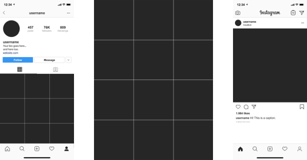
Beyond Print The Instagram Grid
One of the most succinct ways to communicate a brand identity and company ethos is through their Instagram grid. Think about some examples of brands, companies, and organizations that you think use the grid successfully to create a unique identity. Take note of what characteristics come across through their selections.


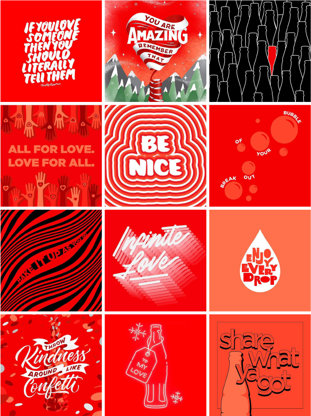
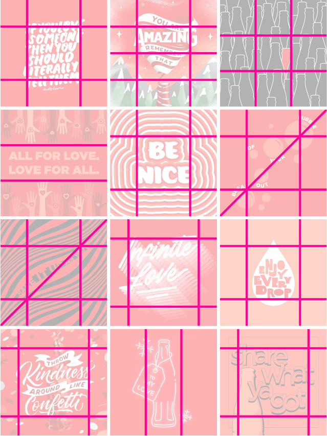
@cocacola
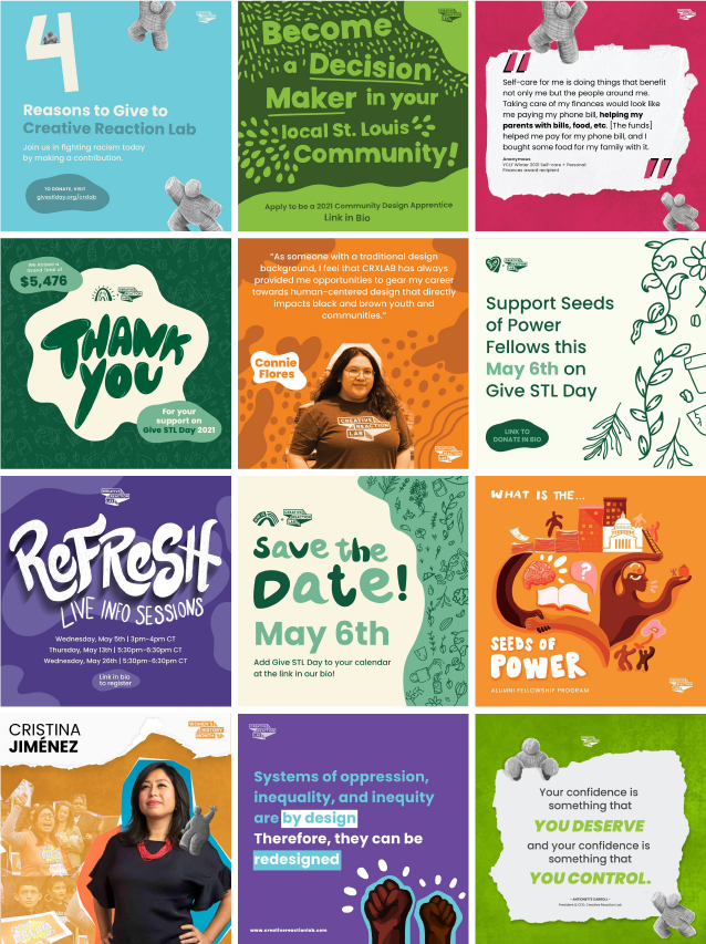
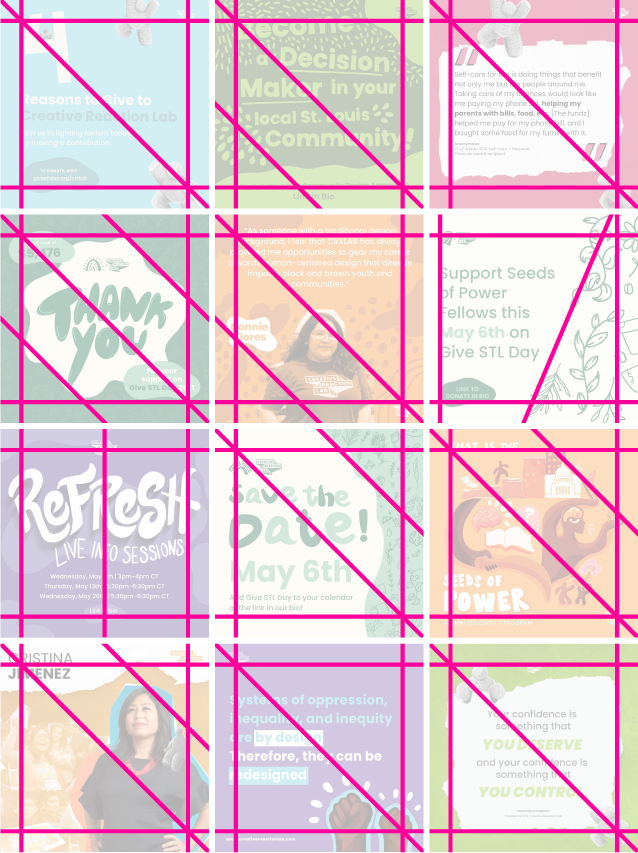
@crxlab
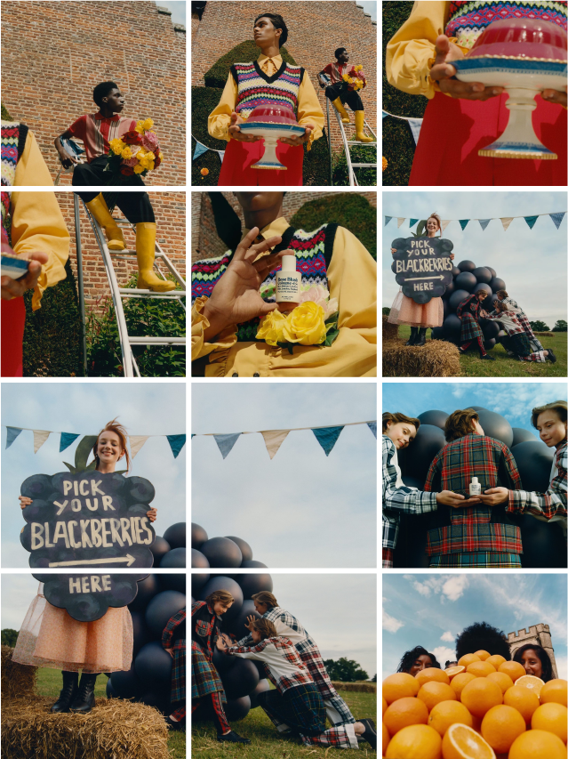
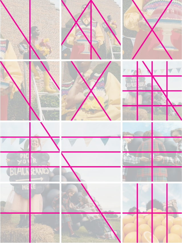
@jomalonelondon
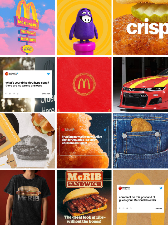
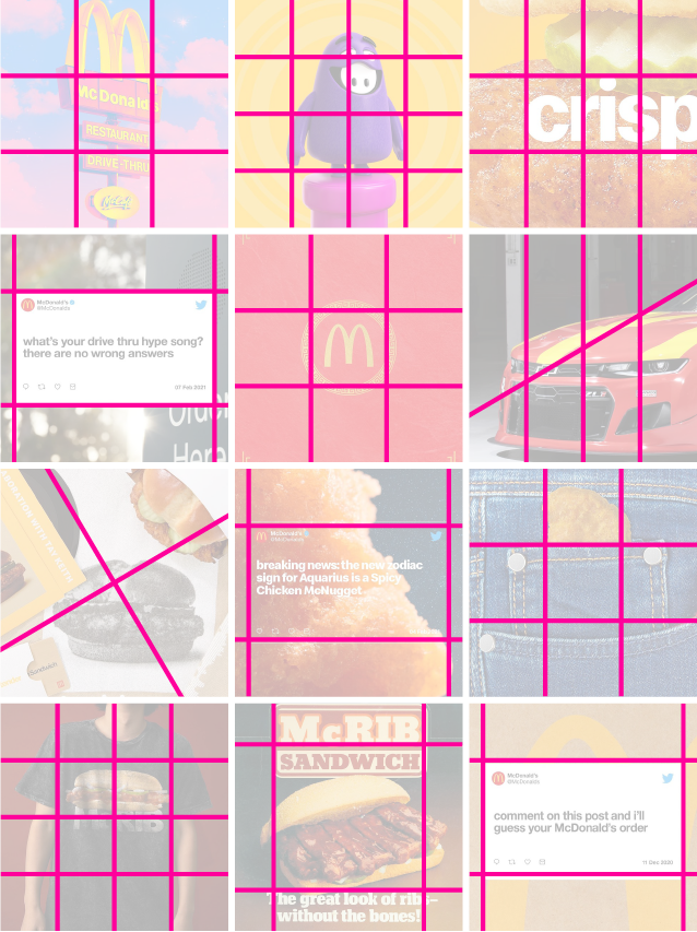
@mcdonalds
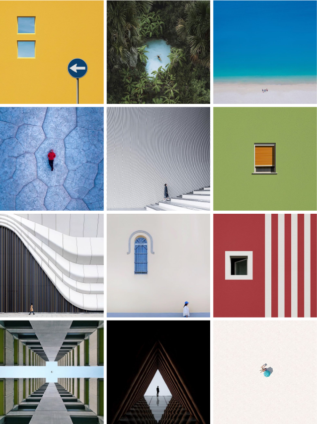
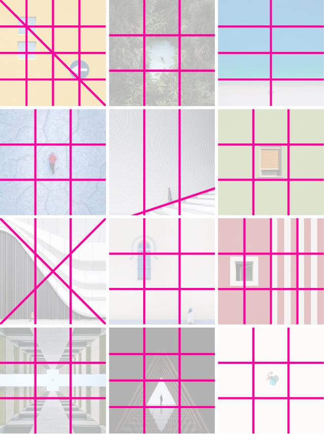
@minimalism
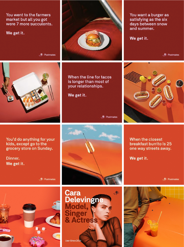
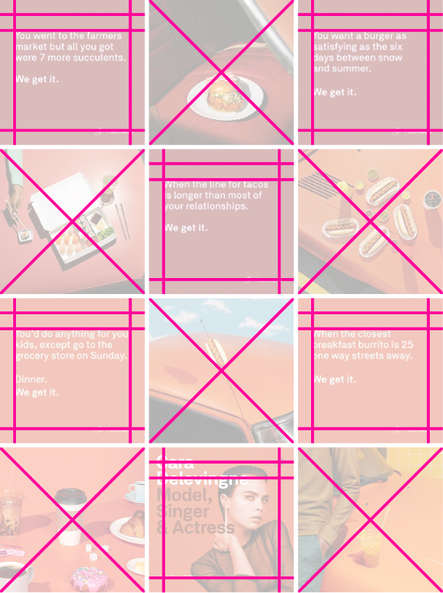
@postmates
Assignment
Create a brand or company, or choose an existing one that you would like to represent. (Get creative—anything from a coffee shop to a shoe line to vegan leather goods!)
Carefully choose images and create graphics to lay out in your grid that you think are representative of your brand identity.
Reflect
How does the grid enhance or limit your ability to express your brand identity?
Select submissions will be posted on the website to highlight student work. Please Note: Submissions received before December will be reviewed and posted by February 1st. Submissions received between January and May will be reviewed and posted in June. Entries are accepted from all countries.
Alt Text Requirement
Alt-text is a written description of an image that allows those with low vision or blindness to experience the piece. How would you describe your design?
Submission Specs
Post: 1200px x 1200px
Mockups: Provided
File Format: .jpg, .png
Color Mode: RGB
Resolution: 72 dpi/ppi
Max File Size: 4MB
